"Occupancy is
the currency
of smart spaces"
My Role: Service Designer
End-to-end design for an IoT solution for office and commercial spaces. Design of interconnected and interdependent systems consisting of physical and digital artifacts, human actors, technology touchpoints, and infrastructure that offer a holistic user experience.
Strategy & Concept
Our solution
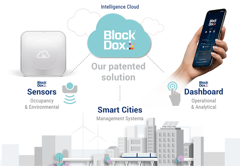
What we do
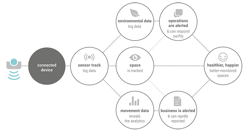
Unique sensors detect information about the metabolism inside a building and other surrounding spaces which we usefully interpret, enhance and make the big data available in our dashboard hub to our clients.
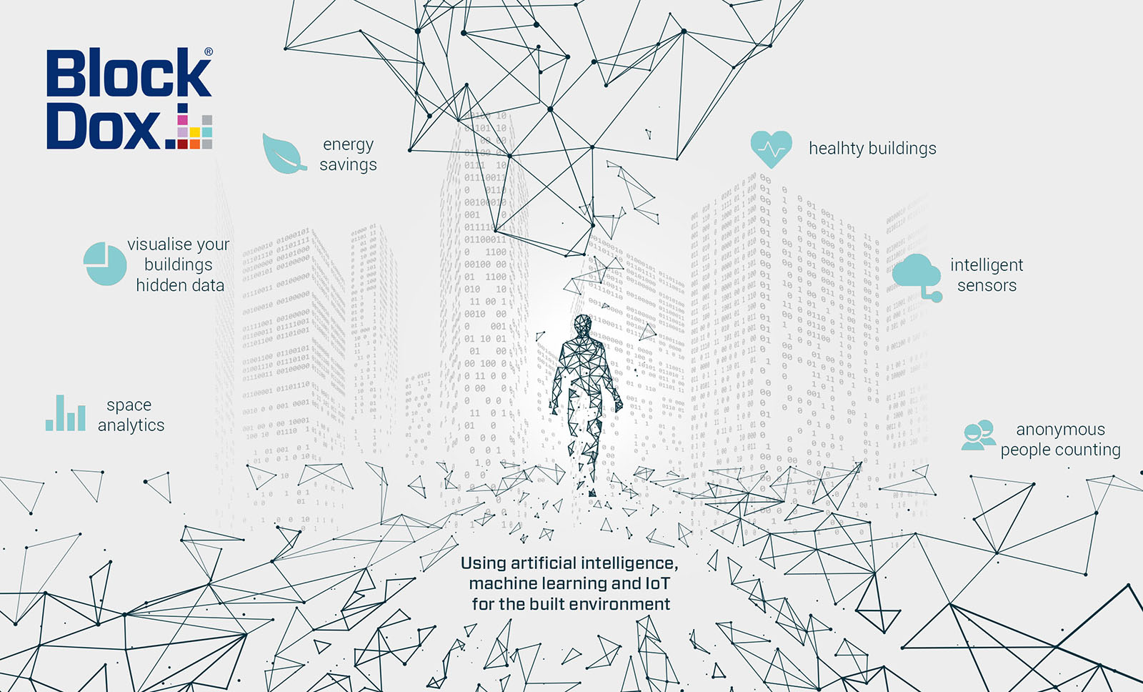
Making spaces smarter
Detecting people anonymously and turn big data into actionable insights by interoperating with the management systems.
Using IoT sensors and artificial intelligence to count people, analyse people flow, and measure indoor environmental conditions.
"Improved air quality can increase productivity by 34%"
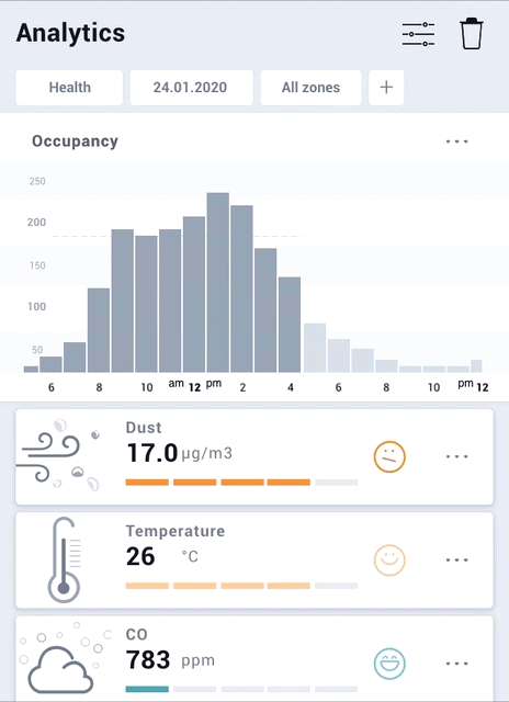
Environmental sensor analytics integrated with the real-time occupancy data and using multiple disparate datasets as Carbon Dioxide (CO2), Temperature, Relative Humidity (RH), Volatile Organic Compounds (TVOC), Particulates (PM2.5).
Takeaways
Surroundings
Having a design process provides me with a framework on how to best tackle a problem by breaking it down into series of interconnected systems. In the first place, everything starts with understanding how spaces are being utilised and having better knowledge of the areas which are performing well and those which can be improved.
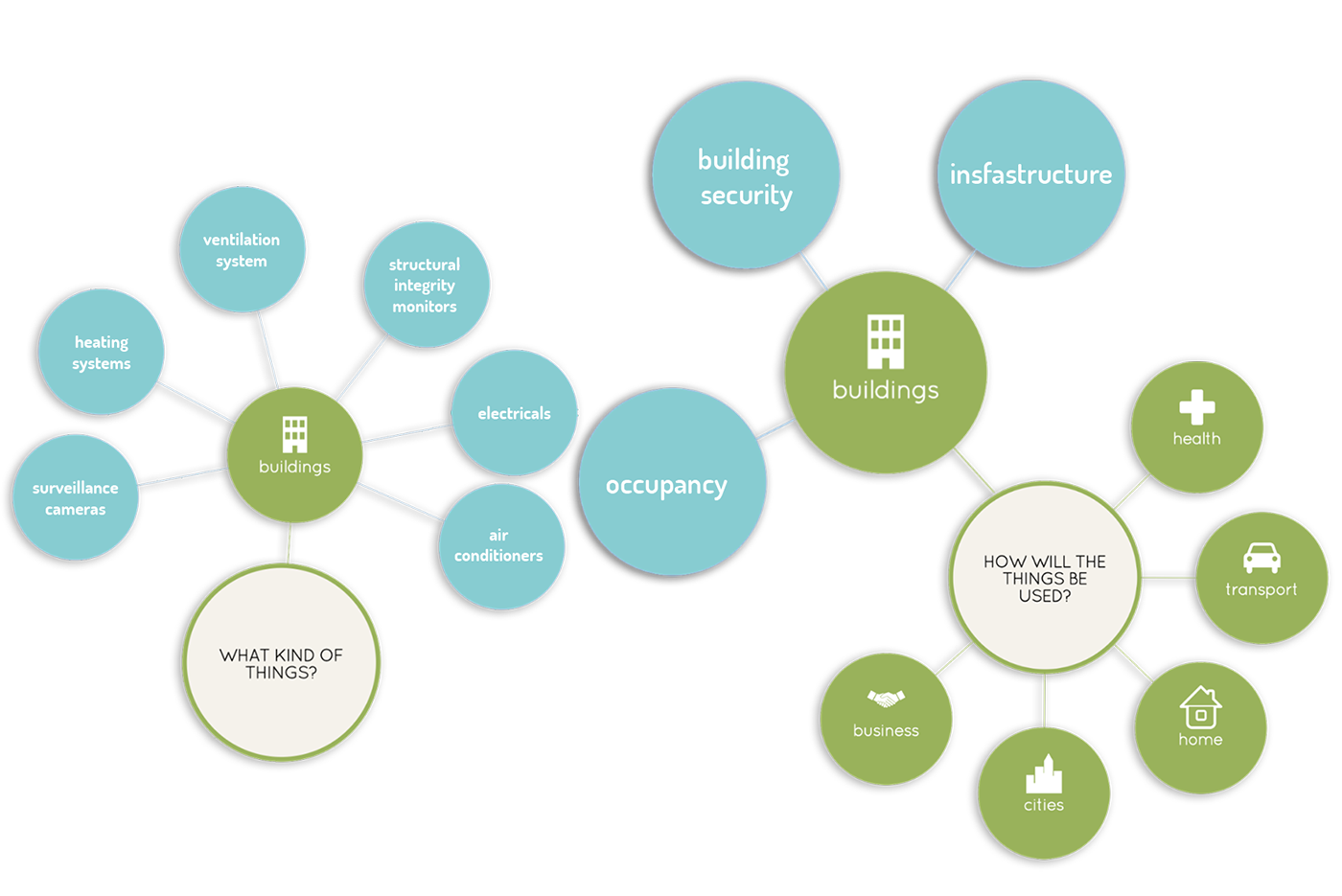
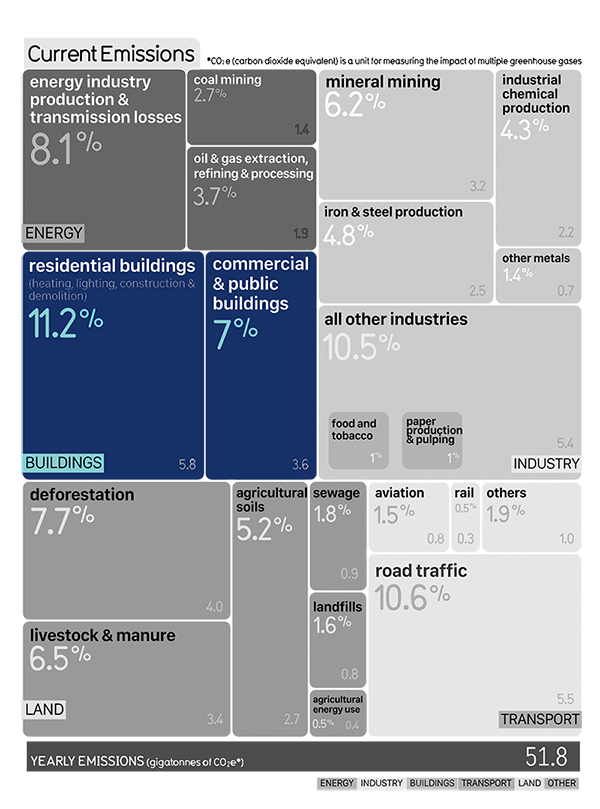
Available people counting solutions

What we want to achieve
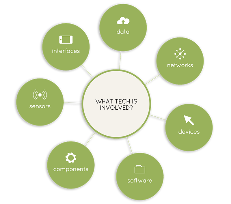
Building metabolism
The challenge is to interpret and enhance the information that sensors usefully detect and create about the metabolism inside a building or the other surrounding spaces.
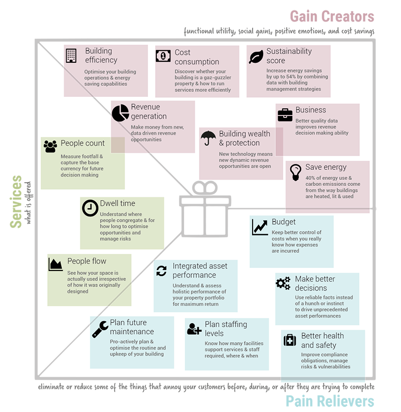
Value map
Customer profile
Over the last several decades, large portions of the world's industrialised economies transitioned from manufacturing products to delivering services.
The tech industry has been a huge part of this transition.
Software to Service
Hardware to Product - service systems
Each client is unique so I employ an iterative and adaptable design process that fits within client's methodology.
Each process varies depending on the service required which includes product design, mechanical design, installations, app configurations and user experience design.

Invent
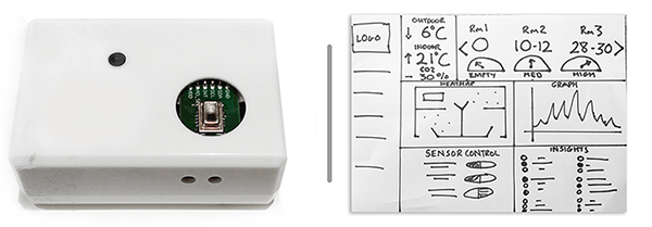
First prototypes & dashboard ideas / February, 2017
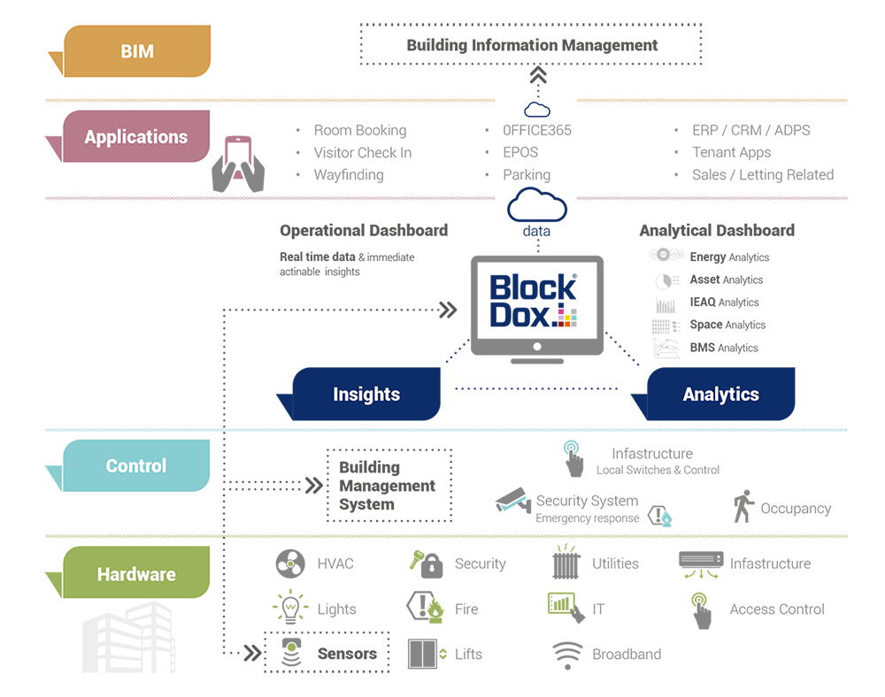
BMS Ecosystem
App Design
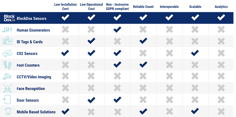
Information Architecture
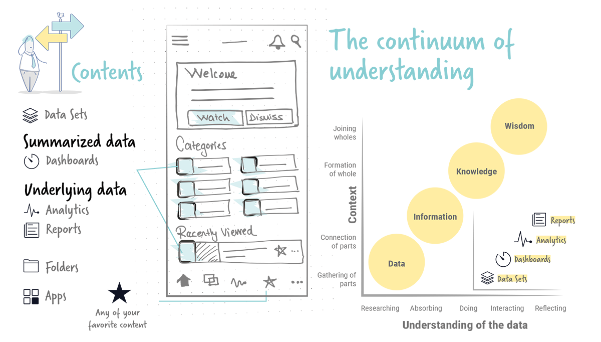
Data
Data, itself, has no intrinsic meaning. It is meaningful only through the act of comparison.
Information
This involves sorting data, processing it, and presenting it in a format which brings substance.
Knowledge
We examine the information in a viable context so that we can discover the value and how it can be put to work for us.
Wisdom
We have become able to judge the data itself with so much knowledge and expertise gained.
Processing the raw data
Reports
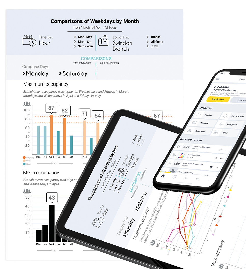
Dashboard & Big Data
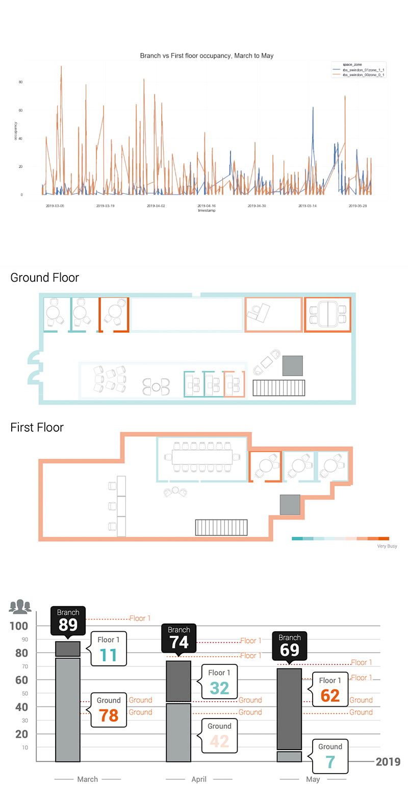
The type of dashboard should be determined by the user roles and needs you to seek to satisfy. Product may have multiple roles that should each get a unique dashboard. Lower tier managers may require operational dashboards, while higher management may have a greater need for an analytical dashboard and reports.
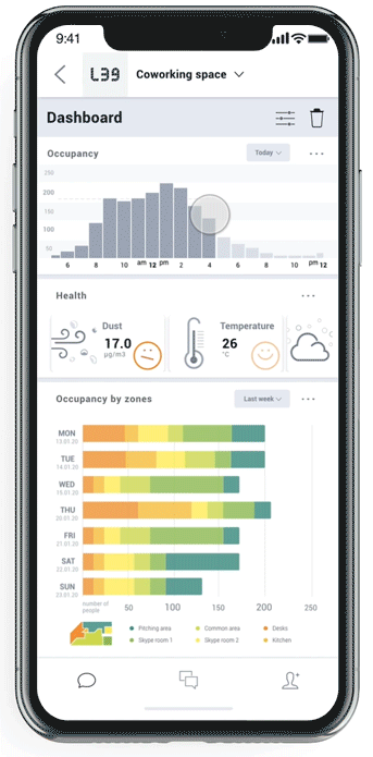
Operational Dashboard: Operational dashboards aim to impart critical information quickly to users as they are engaged in time-sensitive tasks. The main goals of the operational dashboard are to present data deviations to the user quickly and clearly, show current resources, and display their status. It’s a digital control room designed to help users be quick, proactive, and efficient.
Analytical dashboard: In contrast to Operational dashboards, Analytical dashboards provide the user with at-a-glance information used for analysis and decision making. They are less time-sensitive and not focused on immediate action. A primary goal of this kind of dashboard is to help users make the best sense of the data, analyze trends and drive decision making.
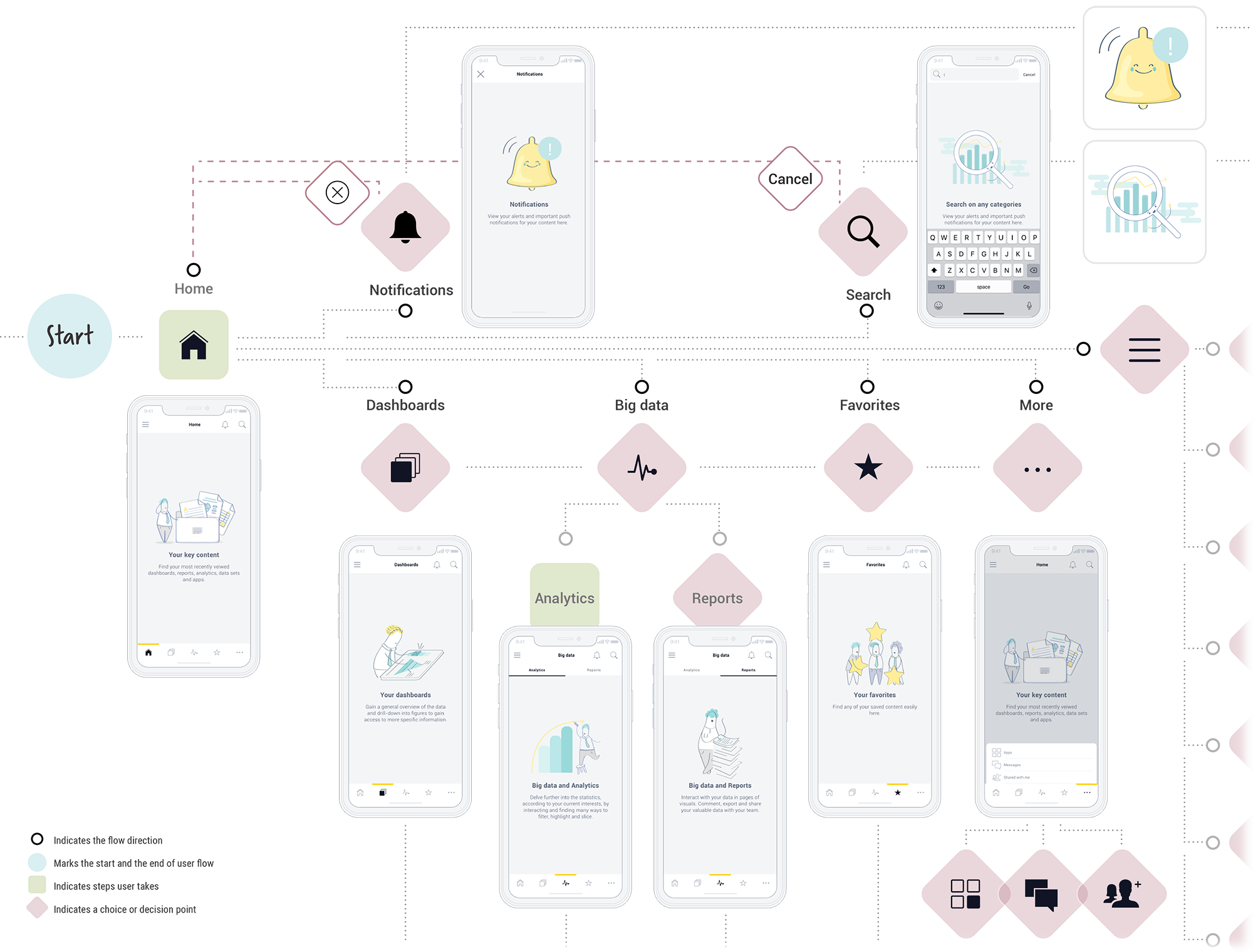
User Flow
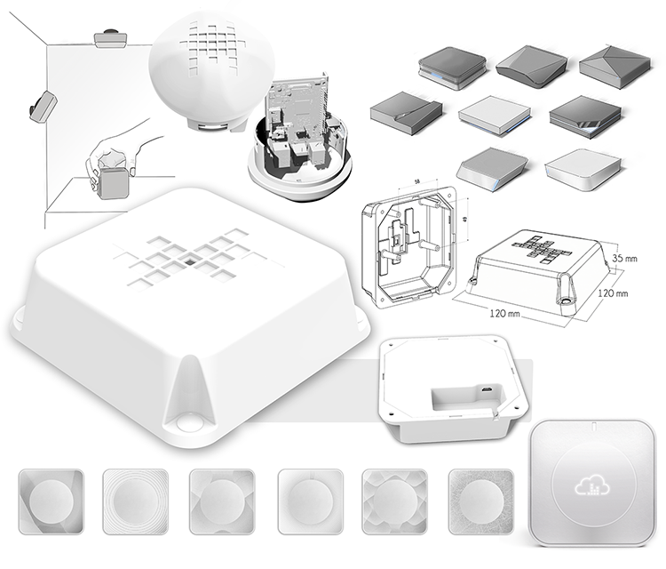
Product Design & Installations
Prototypes & Show cases
Worked with partners and stakeholders to articulate and sequence the steps needed.
Concept designs; Prototypes to Manufactured products
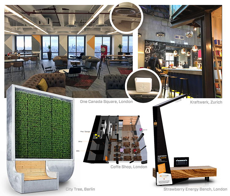
Just a few pilot indoor & outdoor installation examples
User Scenario
The outcome of activity analysis:
What steps are involved?
What are the artefacts?
What are the goals? How will you measure success?
What are the pain points?
Storyboards to convey sequence of the tasks being illustrated.
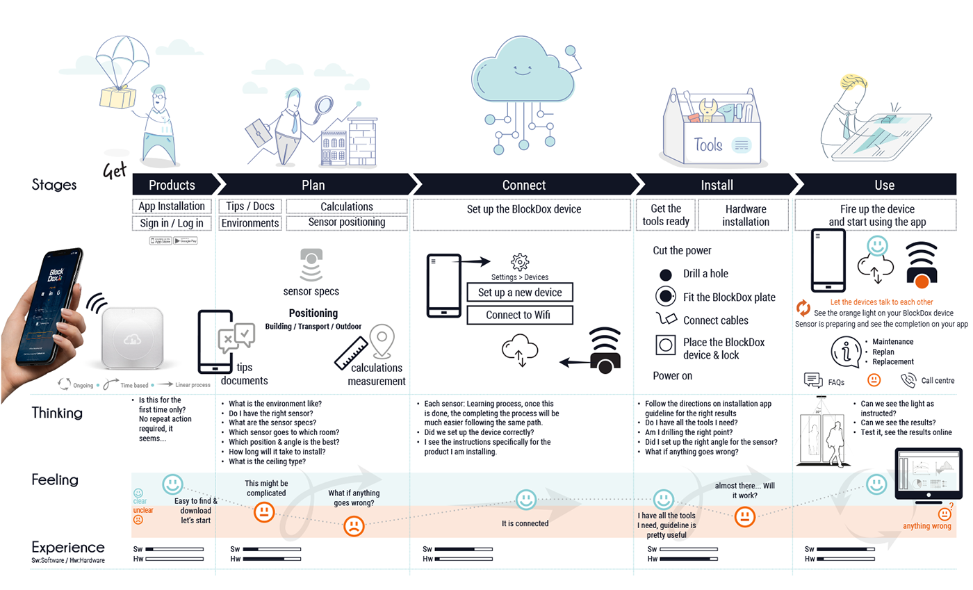
Installation App
Installation app to guide through different scenarios & needs
The key innovation of the graphic user interface is that input is directly on top of output.
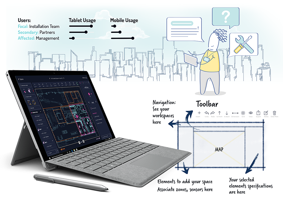
The installation guideline and recommendations created on the fly for different environments, settings & products on the app.
Choosing the right methods to analyse and represent the data
Methods to analyse
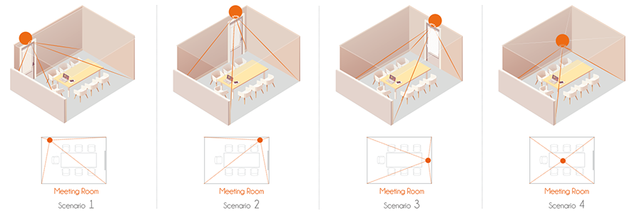
The Bayesian approach is potentially an extremely powerful tool because it allows us to include our prior knowledge about our installations in a natural way to improve the data, without having to code complex heuristics as "if this then that" rules. We can extend this model to include information from PIR motion sensors, or any other occupancy data (light levels, CO2, electricity consumption, wifi etc.), and this is an area to improve the occupancy output for smaller rooms such as meeting rooms.
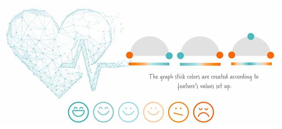
Value set up for health data
There are variations to display every distinctive feature on BMS system; there is an ideal or over value shown in
numbers, percentages, degrees, etc.
Color codes and icons are used to quick scan and detect emergency. Over values can be set up to shown on notifications.